Interactive video shows how Covid spread through Glasgow’s neighbourhoods during 2021


Coronavirus infections surged across Scotland during the summer months, with the race on to vaccinate enough people to counteract the increase in socialisation as we emerged from long months of lockdown.
Glasgow in particular was subject to sharp spikes in cases, linked to fans gathering for football matches.
Advertisement
Hide AdAdvertisement
Hide AdBut how have cases fared where you live in the city compared to neighbouring areas?
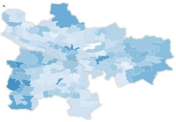
GlasgowWorld has created an interactive map showing the spread and ebb of coronavirus throughout the city during 2021.
Darker areas show higher number of cases by neighbourhood, revealing a surge in cases throughout June and July as the economy reopened – a surge that has since died back.
The data is based on confirmed cases per 100,000 people in rolling seven-day periods, based on the date of test.
Advertisement
Hide AdAdvertisement
Hide AdThe neighbourhoods are intermediate data zones – small geographic units used in official Scottish statistics. When there were only between 0 and two cases during the week, the figures are suppressed to protect anonymity. The rate appears as 0 in the map.
Where has the highest number of cases?
The figures, taken from Public Health Scotland’s open data portal, show the highest rate of cases recorded so far in 2021 was in the Pollokshields West area in the week to 14 May, with 1,566 cases per 100,000 residents.
The latest data, which covers the seven days to 7 August, shows Carntyne has the highest rate (799) followed by Carmunnock South (401) and Nitshill (395).
Loading....
How accurate is the data?
Government Covid data uses the latest mid-year population estimates from the Office for National Statistics (ONS) to work out rates per 100,000 people.
Advertisement
Hide AdAdvertisement
Hide AdThe ONS uses university students’ term time residences when estimating the number of people who live in an area.
Glasgow, as a university city, could therefore have misleading case rates in areas heavily populated by students, as the positive cases outside of term time may actually be among a much smaller population than is represented in the data.
That is because if an area has 100 cases among a population of 7,000 people, its rate would be 1,429 per 100,000 people – but if 2,000 of those residents are students who are not living in the area during the holidays, the true rate would be 2,000 cases per 100,000.
What is the situation now in Glasgow?
Of Glasgow’s 136 data zones, 70 (51%) saw a drop in cases in the seven days to 7 August compared to the week to 31 July.
Advertisement
Hide AdAdvertisement
Hide AdCurrently, vaccine uptake for first doses in Glasgow is at 82.7%. That was as of 10 August.
The UK average is 89.1% while Scotland’s is 90.9%. For second doses, Glasgow’s coverage is at 66% compared to 75.3% across the UK and 76% in Scotland.
You can see a larger version of the map here.
Comment Guidelines
National World encourages reader discussion on our stories. User feedback, insights and back-and-forth exchanges add a rich layer of context to reporting. Please review our Community Guidelines before commenting.
