What is the Glasgow font? Charles Rennie Mackintosh’s typeface explained
The font appeared extensively across Mackintosh’s work in Glasgow - and was adapted by fans of his style for use in modern day works of art.
and live on Freeview channel 276
If you’ve lived in Glasgow long enough you’ll no doubt have seen this man’s handwriting etched onto buildings and replicated by organisations across the city - or maybe even in film or TV in shows like American Horror Story or movies like Spider-Man 2.
The art-nouveau font we see across Glasgow today was developed by Glaswegian architect Charles Rennie Mackintosh - and is based on his own handwriting he used in architectural drawings.
Advertisement
Advertisement
Mackintosh was active as an architect in the late 1800s - and in many ways his works influenced the arts and culture we see in Glasgow today.
His lettering appeared on his many projects, which itself was reminiscent of his architecture, which heavily featured the contrast between strong right angles and floral-inspired decorative motifs with subtle curves.
Mackintosh designed several buildings in Glasgow:
- Glasgow School of Art
- Queen’s Cross Church in Maryhill
- The Willow Tearooms on Buchanan Street
- The Daily Records old office on Renfield Lane
- Former Herald office on Mitchell Street, now The Lighthouse
All of his major commissions were between 1895 and 1906, including designs for private homes, commercial buildings, interior renovations, and churches.
Mackintosh also designed furniture - which in itself was very similar to his handwriting, long vertical backs and small square flourishes.
Advertisement
Advertisement
His designs were certainly unique but weren’t truly recognised in their time - only receiving wide-spread global recognition for his impact on design when Glasgow became a European city of culture in 1990.
Following that Mackintosh became far more popular globally - with typography and calligraphy enthusiasts taking a particular interest in his lettering.
In 1990, Tony Forster designed a contemporary typeface heavily inspired by Mackintosh and the face for the Willow Tea Room - called ITC Willow - the typeface is distinct for the double crossbars on the uppercase A and H, and the unusual design of the uppercase O, which is raised above the other letters, with two dots centred beneath the bowl.
In 1996 - an official font was developed by one Phill Grimshaw in collaboration with the International Typeface Corporation, and the Glasgow School of Art.


Advertisement
Advertisement
The fonts grew arms and legs - with a variant of ITC Willow being used prominently in the series as well as within the series logo itself. Its use was notable among TV and movie buffs since it has never been used within the horror genre before.
It was also used in Sam Raimi’s 2002 film Spider-Man 2 - featured in the display signage for the Broadway play ‘the importance of being earnest’ in which Peter Parker’s girlfriend was debuting in.
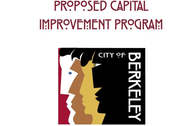
The film’s director spent some time at the Glasgow School of Art, where Raimi became a big fan of Mackintosh’s work - specifically ask fingor this font to be used in the making of the signage. The City of Berkeley in California USA also uses the Mackintosh font in the logo and official communications.
The lettering, much like Mackintosh himself, is inseparable from the city - and is an instant and elegent representation of the Glasgow style.
